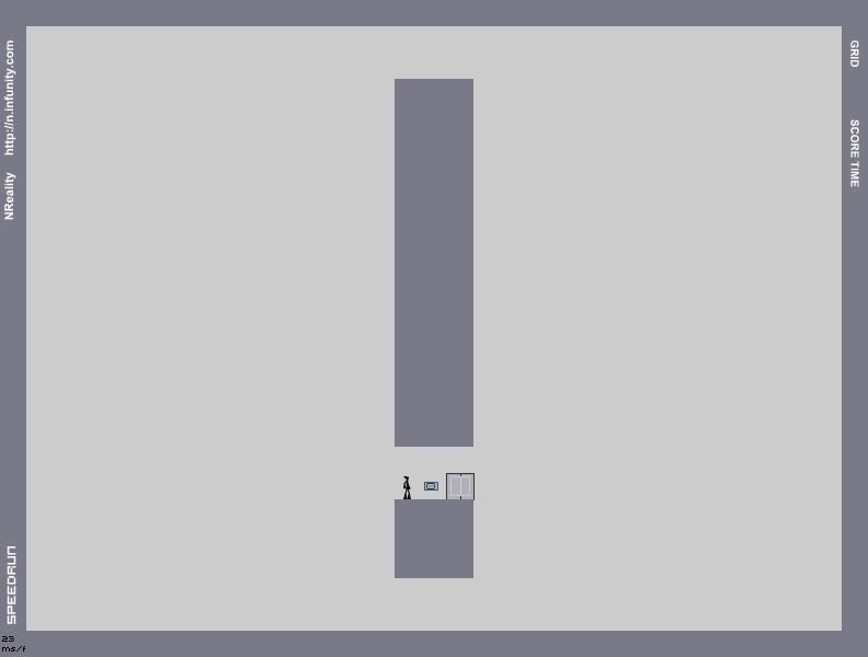
DECLARATION OF INTENT
Hover over the thumbnail for a full-size version.
| Author | maestro |
|---|---|
| Tags | author:maestro maestro rated |
| Created | 2010-06-28 |
| Last Modified | 2010-06-28 |
| Rating |
3 by 36 people.
|
| Map Data | |
| Description | If my account is not returned to its former glory in 24 hours along with a formal apology, rocket_thumped will be banned from every facet of the community.
That is all. UPDATE: rocket_thumped has been a good man and chosen to yield rather than face utter obliteration. Let this be a lesson to all of you! ALSO: why does no-one pay attention when I make real maps ;______--; |
Other maps by this author
Comments
2010-11-28
oh my god
I cannot people are still making that joke. I am facepalming so goddamn hard right now.
2010-07-11
maestro
my account turned white. Can you do anything to this or can't you? it's now like that for 3 weeks now. Thanks
2010-07-06
THAT...
is exactly the same as mine, except with a 20 in front instead of a 21. i dont know how the hell that happened but my demo still stands im afraid.
2010-07-06
@Rozer
beat you back again:
| Demo Data |
|---|
2010-06-29
I don't get what all the fuss is about...
...the mine placement was fine.
2010-06-28
Haha, awesome retile IWBT xD
2010-06-28
Object placement is amazingly amazing.
The tiles are so great and so simple; they look brilliant both in thumbnail in full view. The gameplay is just outstanding - there are about 4917508269363 routes and so many gold catching possibilities. I loved the gold patterning, mines are also placed perfectly. The oneway glitch use is just awesome and riding those thwumps is really fun.
This is the best map. Ever.
:O
This is the best map. Ever.
:O
2010-06-28
cuban crissle misis.
wait, what?
2010-06-28
Not maxed ferox, not even this.
| Demo Data |
|---|
2010-06-28
aphex has it
has it more than mc hammer.
2010-06-28
5aved, im just speechless
there were a few ares in here theat jsut bothered me though, like the gold placement. Those gold patterns make my eyes water and the made AGD kinda hrd to get. the gold here:

Should be taken out, it's ugly and herd to get.
as for the lasers, they seem to pin you down at about here:

This leaves for that gauss to get an easy kill, but the lasers let you get some close calls in there
but other than that, I loved that corner-jump you have to make and all the different routes you can take to this.
Oh, and thats an AGD :P

Should be taken out, it's ugly and herd to get.
as for the lasers, they seem to pin you down at about here:

This leaves for that gauss to get an easy kill, but the lasers let you get some close calls in there
but other than that, I loved that corner-jump you have to make and all the different routes you can take to this.
Oh, and thats an AGD :P
| Demo Data |
|---|
2010-06-28
hmm...
The tiles are a bit stretched horizontally; An exclamation mark should be thinner.
Here's one I made earlier:

Now, comparing it to your map, we can obviously see that the tiles for your map are too wide.
It is because of this I rate this a zero. I would rate a 2 or 3, but I'd hate to encourage you to make maps of this standard (or lower).
Try to make this map again. However instead of jumping straight into making an exclamation mark tileset (which you obviously are not ready for at the moment), why not do some research? Afterward you might be ready to attempt to make a tileset that does justice to the beauty of the exclamation mark.
For research and further reading please look at the following:
http://pgiw.wordpress.com/2009/04/29/the-exclamation-mark-is-back/ [pgiw.wordpress.com]
http://keywen.com/en/EXCLAMATION_MARK [keywen.com]
http://exclamationmark.pastebin.com/z58ZGfdY [exclamationmark.pastebin.com]
Here's one I made earlier:

Now, comparing it to your map, we can obviously see that the tiles for your map are too wide.
It is because of this I rate this a zero. I would rate a 2 or 3, but I'd hate to encourage you to make maps of this standard (or lower).
Try to make this map again. However instead of jumping straight into making an exclamation mark tileset (which you obviously are not ready for at the moment), why not do some research? Afterward you might be ready to attempt to make a tileset that does justice to the beauty of the exclamation mark.
For research and further reading please look at the following:
http://pgiw.wordpress.com/2009/04/29/the-exclamation-mark-is-back/ [pgiw.wordpress.com]
http://keywen.com/en/EXCLAMATION_MARK [keywen.com]
http://exclamationmark.pastebin.com/z58ZGfdY [exclamationmark.pastebin.com]
2010-06-28
This
is the best use of oneway cheating and thump mechanics I have ever seen. Easy 5.
2010-06-28
whoa!
this is way better than those Numacon maps!!
2010-06-28
My personal opinion
The enemy placement made it WAY too easy. The tileset was good, though. 3/5.
2010-06-28
thats weird
there are many comments on the mine placement, but I don't see any mines. Maybe I'm just stupid.
2010-06-28
Amazingly
well thought out, well balanced map. Mine placement was wonderful. 5/5
2010-06-28
i zeroed this shit
2010-06-28
yeah
you maxed it
| Demo Data |
|---|


RandomDigits
AGD.