


The Fall of Man part 3
Hover over the thumbnail for a full-size version.
| Author | Cossack |
|---|---|
| Tags | author:cossack bitesized n-art non-playable rated sci-fi |
| Created | 2007-11-26 |
| Last Modified | 2007-11-26 |
| Rating |
4 by 30 people.
|
| Map Data | |
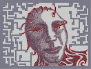
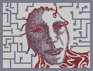
| Description | Well this is part 3 - should this be the final part? Compare it with part 2 (found here: http://numa.notdot.net/map/109158 ) and see what you think. Suggestions will be very welcome, i want to get this good. this is the longest ive spent on an nart. |
Other maps by this author
 |
 |
 |
 |
 |
 |
| Gimme Your Soul | Look into my Eyes | Digital Blasphemy | The Fall of Man part 1 | No Rest for the Wicked | The Fall of Man part 2 |
Comments
Pages: (0)


2009-02-12
creepy
creepycreepycreepycreepycreepycreepycreepycreepycreepycreepycreepycreepycreepycreepycreepycreepycreepycreepycreepycreepycreepycreepycreepycreepycreepycreepycreepycreepycreepycreepycreepycreepycreepycreepycreepycreepycreepycreepycreepycreepycreepycreepycreepycreepycreepycreepycreepycreepycreepycreepycreepycreepycreepycreepycreepycreepycreepycreepycreepycreepycreepycreepycreepycreepycreepycreepycreepycreepycreepycreepycreepycreepycreepycreepycreepycreepycreepycreepycreepycreepycreepycreepycreepycreepycreepycreepycreepycreepycreepycreepycreepycreepycreepycreepycreepycreepycreepy.
and creepy
and creepy

2008-08-29
yeah I knew that
but hell, it fit!
2007-12-06
the curves
are fantastic.
I can't get smoothness like this.
I can't get smoothness like this.
2007-12-06
awsome
its awsome

2007-11-30
5.
love the changes to the tiles ^^ this is definately one of your best n-arts ever.

2007-11-29
Holy wow?
I think I lost my jaw...

2007-11-28
i say mister giiiiiiiiiiiii

2007-11-28
@ mrgy05
im was about to release a beta version of my program this week, but i had exams and i desperately need to rebuild the script...
btw how do you pronounce your name mrgy?
btw how do you pronounce your name mrgy?

2007-11-27
aaah
i see what you mean now. ok. looking at it now - i guess it is a little light on the shading - but as it is i want to keep the right side white so i may just darken the left. and ill see what i can do about the tileset.
i think ill do a next part - and ill make it the final version :D thanks for your oppinion - always appreciated
i think ill do a next part - and ill make it the final version :D thanks for your oppinion - always appreciated

2007-11-27
Well
The right side is very bright compared the the left. Leaving the right side highlighted with such a high contrast white and the left a semi-even shaded feeling, it just seems off.
Another way to put it, if you have heavy exposure of light on one side, you would have heavy exposure of dark on the other, right?
And there are just a few spots that seem "empty" around the face, such as above the bottom right portion of mines (inbetween the tileset) and in front of the top right eyebrow. Just small things like that, but use your judgement not mine :-)

2007-11-27
Peachy!
Great job getting bitesized ;)
It really looks even better now, I already like the second part. The shading on the torso adds a great effect, and as stated below, the hair thingies look more 3d.
I still hold to my 4.5/5 ^^
It really looks even better now, I already like the second part. The shading on the torso adds a great effect, and as stated below, the hair thingies look more 3d.
I still hold to my 4.5/5 ^^
what part exactly? the tileset, or on the face? i also like the mines - but i cant see where they can be added here to make it better altho ill have to see.
hopefully this is the start of an evolution of my style - so that its not just silhouettes but tribal designes with art - like best of both worlds :D
hopefully this is the start of an evolution of my style - so that its not just silhouettes but tribal designes with art - like best of both worlds :D
2007-11-27
@ ]{N03
Maybe not autogenerated, I beleive that. However, you did confess using a "home-made program" that you create to make N-Arts. Like I've said before on one of your maps, if you use a program that's unfamiliar in the NUMA community (and you won't release it) expect to get alot of shit over it.
@ Cossack
Alot better than part 1, I like the 3d effect you achieved on the head with the hair. I generally like most of the abstract shapes made out of mines (hair, or whatever it's suppose to be)
I think the semi-shaded effect took away from the huge contrast of white, on the right side of the N-Art, it seems easier to start with a medium guass color and darken from that, then to try and incorporate the white background into the N-Art.
Also, I think you're going somewhere with the mines (like I said on top) so for the background, maybe more abstract mine-shapes?
Who knows, you said you wanted suggestions. ;-)
2007-11-27
btw
i dont autogenerate maps...
... i take no offense from your comments on Baldur's gate, but
PLEASE get your facts straight...
... i take no offense from your comments on Baldur's gate, but
PLEASE get your facts straight...
2007-11-27
i take it
that it's sposed to look unrealistics and cartoonish...
it's better than average, but i dont actually like it.
for form and function though, 3;
it's better than average, but i dont actually like it.
for form and function though, 3;

2007-11-26
The best N-art ever.
25/5

2007-11-26
5avsized
nice art
i remember the first part of this
this is so much better though
i remember the first part of this
this is so much better though
2007-11-26
well
i have no idea - probably a couple of hours all together. it was getting N to work while laggy as hell that was annoying :P
and people - come - speak up! :P
and people - come - speak up! :P

sniperassassin
woah...