


Abstract #1
Hover over the thumbnail for a full-size version.
| Author | ThePegasus |
|---|---|
| Tags | abstract author:thepegasus fun nreality rated |
| Created | 2009-10-04 |
| Last Modified | 2009-10-04 |
| Rating |
3 by 22 people.
|
| Map Data | |
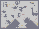
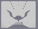
| Description | This is the first in a series of maps I am going to start making.
 |
Other maps by this author
 |
 |
 |
 |
 |
 |
| Kickstart My Heart | Go! Go! Go! | Eye See You? | Bird and the Worm | 1 part at a time | What's With All the N-art? |
Comments


2009-10-04
Meh.
Both the image and the gameplay I believe were bad. D:
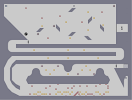
While the "abstract tiles" may be colorful, they don't look really good at all, to be honest. I understand that the image may have taken a long time to make, but the image in this didn't really make it anymore fun to play in. As for the tiles, while they may be abstract, they don't look good to me either. ;-;
Gameplay was okay as well. I didn't get much fun out of dodging the enemies in this one. The mines were poorly placed for the most part, and both the gold and mines didn't look aesthetically appealing either. The top left area was the most annoying, because you had to avoid the gauss, miss the mines, avoid the rocket, and just when you think your safe, you have to avoid that top gauss as quickly as possible too.
So overall, I basically agree with Pig2 in the end. Good luck, though, and keep trying to use the criticism I've given into your favor.
(Hope that didn't sound too harsh) ^_^

2009-10-04
A fat seagull?
I lol'ed.

2009-10-04
Actually...
This looks pretty epic. I loved the design, and since I'm not a complete critic, I didn't look at the lines to try and figure out where or how or what they were made with. I look at the map/image as a whole. Great work, imo.

2009-10-04
I agree with
The pig guy. The gameplay was rather boring, and the image wasn't even very good, looks like it was made in paint. Sorry, 2.5.

2009-10-04
2.5/5
i found neither the image nor the gameplay to be particularly impressive. The colours were cool, but the tiles weren't that nice looking, and they also made the gameplay a little awkward and frustrating for me.

2009-10-04
i'm sorry
i came off as pretty dickish my last comment. I just mean all the freakadelic colors of the tiles clash weirdly with the lines, is all

2009-10-04
.
I was kinda expecting some on to say that palemoon. I was if-e about it. I could've done better.

2009-10-04
@t3chno:
awe.some.
2009-10-04
the black lines are really bad
2009-10-04
thanks bro
thanks man. I'm glad you liked it :)

2009-10-04
awesome awesome awesome awesome awesome
I LOVE THOSE IMAGES!!! Gameplay is pretty good, too imo. 5aved =D
2009-10-04
:)
Thank you diminishedD6. My brain felt the same way. :D

2009-10-04
Eye Candyyy
good for DiminishedD6's brain.
faved
faved

2009-10-04
MY EYES!
their burned out of their sockets from very bright colors!
XD rather interesting map. on nreality, i havent been able to get a foreground, but im working on it ;D
XD rather interesting map. on nreality, i havent been able to get a foreground, but im working on it ;D
2009-10-04
hahahahah
that made me giggle. gj.

2009-10-04
If I was to name them all,

2009-10-04
Yeah
I got either lobster or scorpion out of that one.

2009-10-04
Thanks stonedeagle
gj on agd. abstract #2 will be on here sometime in the next few days.

2009-10-04
AGD
a bit faster
I spy is fun haha.. i love imagemaps. 4.5/5^... linearity can be good. especially when gies like the rocket can shoot through the linearity. its still fun. the background made me lol. i wanna see abstract #2 now. :D
I spy is fun haha.. i love imagemaps. 4.5/5^... linearity can be good. especially when gies like the rocket can shoot through the linearity. its still fun. the background made me lol. i wanna see abstract #2 now. :D
| Demo Data |
|---|
2009-10-04
Thanks for comment Mekimu
good job on agd

2009-10-04
I spy a...
Giraffe, a butterfly, a (lets just call that and octopus), bird, a snail, a robot, a duck and a guy riding a lizard.
Anyway, good map. Rather difficult (thats a good thing) and linear (no so good thing imo). I thought the top left was the hardest bit of the map.
Anyway, good map. Rather difficult (thats a good thing) and linear (no so good thing imo). I thought the top left was the hardest bit of the map.
| Demo Data |
|---|
2009-10-04
The gameplay
is about as good as the image.
2009-10-04
BrassMachine
Ignore my last comment. Thanks you for being the first one to give me some constructive criticism. btw I thouth the same thing about it looking like an i spy book
Ummmm, yeah... I'm gonna have to ask you guys to not make comments that are irrelevant to my map.. yeah.. it would really help me if i got some real feedback here.. yeah.. oh, and im gonna need you guys to get those TPS reports in asap.. ok? ok...

2009-10-04
Reminds me of an "I Spy" book
Map's kind of limited and strait foward but still used fairly well. Enemys were stagnent for some of the map but I enjoyed it. (there, that's one comment for you)
3.5^
3.5^


back then, the rates i got generally reflected the maps i make. not like today when all my maps get sniped no matter what quality they are. i hate the ratings system.
dont respond to this because i dont want to defend my point.
dont respond to this because i dont want to defend my point.
2009-10-04
YAY!!! :D
Did it work?
2009-10-04
maybe if you give me some feedback
it'll work
ThePegasus
Not at all riobe