


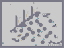
under ground v2
Hover over the thumbnail for a full-size version.
| Author | ufripip |
|---|---|
| Tags | action author:ufripip fun gauss laser unrated zap |
| Created | 2009-09-19 |
| Last Modified | 2009-09-19 |
| Rating | 4 more votes required for a rating. |
| Map Data | |
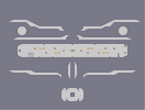
| Description | the "underground" is now smooth. versions so far:
v1: http://www.nmaps.net/180963 |
Other maps by this author
 |
 |
 |
 |
 |
 |
| molecular structure | grid | wide | close to | small town in the outback | under ground |
Comments
Pages: (0)

2009-09-19
1.5/5
and here's why: the zap drones do not cohese with the circular/organic tiles at all, and it makes gameplay in that part of the map even more difficult than the tiles already make it. The thwumps too, are also unecessary. The floorchaser were a good fit with the bottom tiles, and the laser drone is also pretty cool, but ineffective in it's current placement. It would have been more deadly if you have placed it circling around the two tiles directly above it's current stationing. I think a rocket would've work with the tiles as well, but perhaps that would have made moving around insanely difficult. The upper guass turret is useless, really, since it's field of view consists only of the left-most shaft of the upper tiles and the huge void to the left -- and since there are no obstacles here, and there's a fat chance the player will be hiking up the left wall again, the guass turret will not have a chance to take a clear, steady shot at the ninja. The gold distribution on the bottom part of the map doesn't look so good, and it's a pain in the ass to collect with all the zap drones buzzing around you and the slippery 8-tiles. generally, gold sticking out of tiles in various patterns are unappealing to the eye, and hence this type of gold distribution is scarcely employed in mapmaking. the gold pattern you used at the top is fine -- if you were to use the same pattern in the bottom part of the map, gameplay would be less nitpicky and it would improve the overall appearance of the map. Besides that, the map is alright. the top is a breeze to play, and tiles aren't bad either. I think I read too much Victorian literature lol.


2009-09-19
I don't like the placement of it.
I think it should fit in with the tiles.
2009-09-19
was updated
and do you think this map is better than the first version???
2009-09-19
some more gold
is a good idea
2009-09-19
It's great!
Pretty easy, but with a little spicing up and some more gold, this could be really fun.
ufripip
well,