


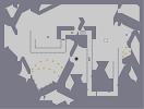
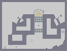
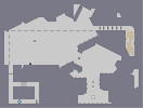
Map.
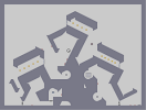
Hover over the thumbnail for a full-size version.
| Author | blackson |
|---|---|
| Tags | action author:blackson rated |
| Created | 2009-02-03 |
| Last Modified | 2009-02-03 |
| Rating |
4 by 8 people.
|
| Map Data | |
| Description | Description. |
Other maps by this author
 |
 |
 |
 |
 |
 |
| It's the Unreal Thing | Communication Breakdown | Oh noez! | asdf | Ohhhh shit | Title |
Comments
Pages: (0)

2009-02-07
This map is good, as always
idk why people don't like it
it reminds me of palemoon, not in the tiles or object placement, put in the simplicity and loveliness of it
faved
it reminds me of palemoon, not in the tiles or object placement, put in the simplicity and loveliness of it
faved


2009-02-03
Pathetic AGD
| Demo Data |
|---|

so i design tiles to suit gameplay, but make gameplay with aesthetic possibilities. I don't know how. I just do.
Mostly. My latest map is an exception, as i did tiles first, then enemies, then gold, then start and finish. Meh.
Mostly. My latest map is an exception, as i did tiles first, then enemies, then gold, then start and finish. Meh.
| Demo Data |
|---|

2009-02-03
:/
slightly faster
| Demo Data |
|---|
2009-02-03
:/
it was okay, not as difficult and chaotic as your previous maps, but flowy and somewhat contemporary, but it was simple. I liked the tiles though, laser had no challenge, only slowed you down.
| Demo Data |
|---|

2009-02-03
Oh yeah
I used to make nice tilesets, and ass enemies to them sporadically, but then I switched and my maps got a lot better really quickly, imo. Now I don't place enemies first, I make a small section of the map, tweak it way too much, then ass more map until it's big enough to pass. :P

2009-02-03
Yeah
It doesn't work too well to place an enemy to fit the tiles. You're left with nice tiles that don't play as well as they should. I'm the other way around, I place the enemies with the tiles, then change the tiles to suit the enemies, which usually ruins any scrap of aesthetics I had. I pretty mush concentrate on making fun maps
2009-02-03
Let the destruction ensue!

Oh, wait :P

2009-02-03
That would destroy the theming of the gold.
I considered it, but later removed it.
@Skyline, I somewhere along mapping became stuck to using minimalism with enemies. I make my tiles, and then throw some enemies down. It's a disease I'm trying to get over. Without testing and twitching the enemies with the tiles, I arrive here.
And the tiles? Next week it'll be something different.
2009-02-03
Actually, that's a good idea tunco
o_O Although less in the laser area and more in that tiny but above the exit switch mine.

2009-02-03
I think GTM's second comment
hit the nail on the head.
3/5
3/5

2009-02-03
And there's the yahoozy card played.
Honestly, I don't think blackson was aiming to or even realised this was similar to Yahoozy (i.e, same as the atob situation with me ;P See the news page on that too).
But yeah, I agree with skyline in the respect it wasn't actually that exciting, despite the fact I think the placement worked well considering what you were trying to achieve, imo. I liked the tileset though, as I said before, but then again that's just subjective.
Also, calling maps "map" and giving them "descriptions" is just really uncreative and boring, no matter which way you spin it.

2009-02-03
sorry
but i have to agree with skyline. 3.5

2009-02-03
Not a good map, as always.
You seem to have a good sense of layout and things like that (the one way gold tunnels are a pretty cool idea), but I think all your maps just lack good execution. Try making the map actually fun to play, you know? I know that's rather subjective, but I think the enemy placement in this is just poor; the ninja barely ever reacts with the enemies. And lastly, you should seriously stop using this same exact messy corner derivation of Yahoozy tilesets that everyone on NUMA today uses. It's just contrived and pretty damn ugly. So I think the two main things here are 1: try to make your maps fun and 2: try to step outside of the box in terms of aesthetics.
2009-02-03
You've been busy :P
This map is good, the flow is a little abstract but the placement and tiles work pretty well. Liking this new theming you've got going on in your recent maps ^_^
furry_ant